
The best accountant websites say who they help and where in the first line, show a Google rating and a real person above the fold, and give one clear next step like booking a consultation. They add pricing or a how-it-works page, service and niche pages, and location pages so they rank and close. The 12 examples below all follow that pattern.
- Lead with who you serve and where. Every strong example names the city or niche before anything else.
- Put proof in the first screen. A Google rating badge and a real portrait beat stock handshakes.
- One main button, repeated. Book a consultation, plus a phone number for people who'd rather call.
- Write for business owners who hate accounting. Talk about keeping more money and getting time back, not debits and credits.
- Skip the template. Messaging, photos and page structure built for your firm are what make these sites convert.
What the best accountant websites have in common
Accounting firm websites have a reputation for being bland, and most earn it. A logo, a stock photo of a calculator and a list of services. The sites below look nothing like that. They were all built by our team, and they share one pattern in the first screen a visitor sees.
The first screen of a converting accountant website
That's it. No clever slogans. A business owner should know in five seconds that you help businesses like theirs, that other owners trust you and what to click next. Everything below the fold backs that up with services, pricing, reviews and answers.
Six accountant websites built to win local business clients
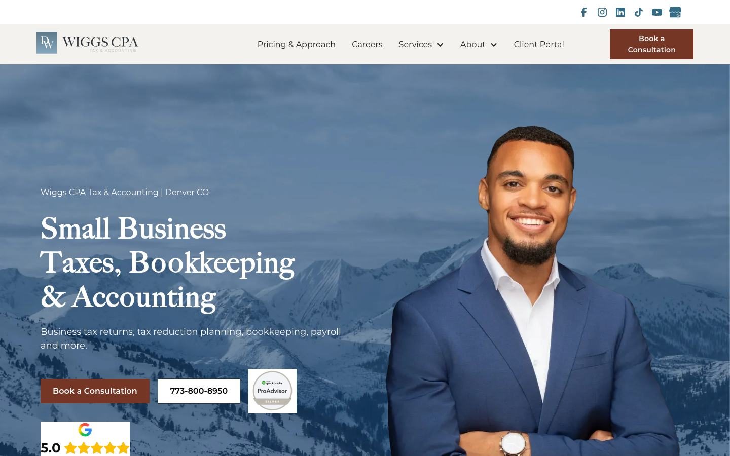
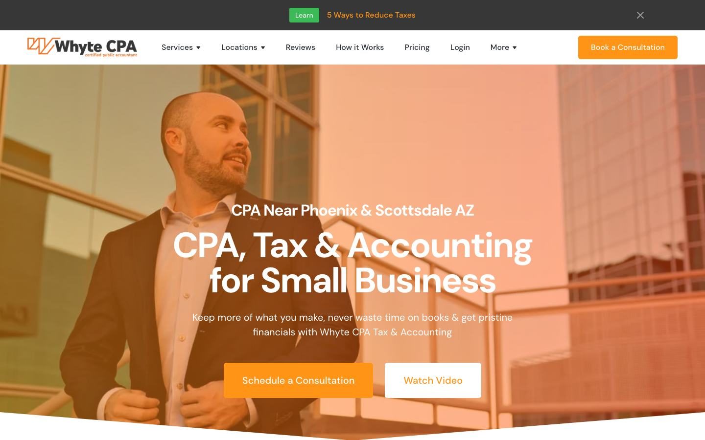
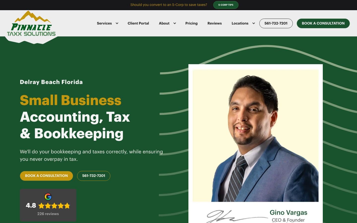
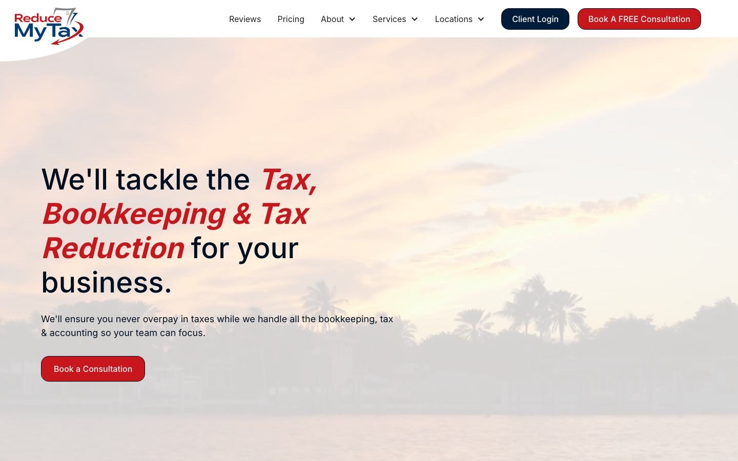
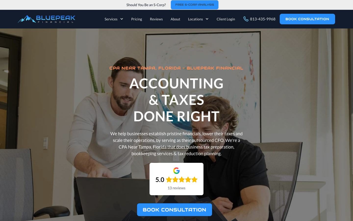
These firms serve small businesses in a city or region. Notice how each one puts the location and the service in the first two lines, because that's exactly what people type into Google.

Five examples that win by picking a niche
The fastest way to stand out is to stop talking to everyone. These firms name an industry or a client type right in the headline, so the right owners feel like the site was written for them.

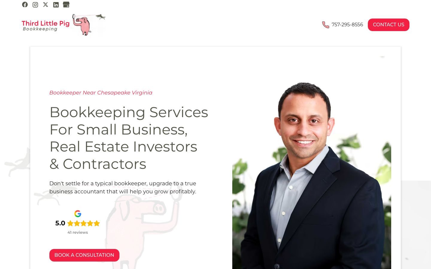
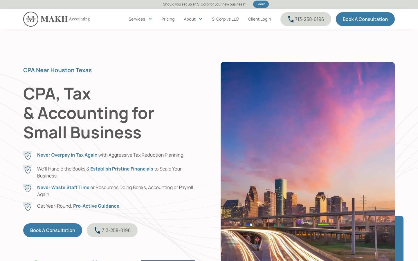
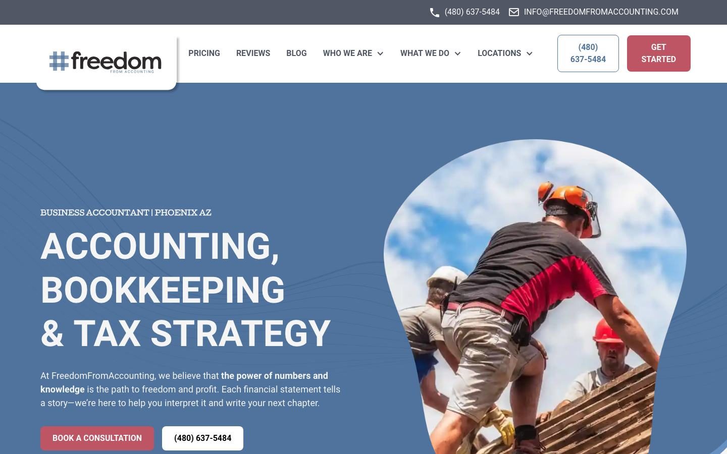
A niche doesn't mean turning everyone else away. It means your homepage speaks to your best clients, and your service pages still cover the rest. We walk accounting firm owners through picking a niche in our accounting firm growth program.
What makes these accountant websites convert
Good looks get attention. These six things are what turn a visitor into a booked call.
Wiggs, Whyte, BluePeak and Pinnacle all say where they are before anything else. It helps you rank and it tells local owners they're in the right place.
Many of these heroes show a real person, and Pinnacle adds the founder's name and signature. Owners hire people they trust, and a face builds trust faster than a skyline.
A Google rating badge sits in the first screen on most of these sites. It answers "can I trust them?" before the visitor has to ask.
Free S-Corp analysis, free QuickBooks review, a tax-saving guide, a video. People who won't book today still raise their hand.
Pricing or How It Works sits in the main menu on most of these examples. Hiding it makes owners assume you're expensive.
"Never overpay in tax" and "know what your business is actually earning" sell. "Full-service accounting solutions" doesn't.
| Template accounting site | Sites like these | |
|---|---|---|
| Headline | "Your trusted financial partner" | Service, who you help and where |
| Photos | Stock handshakes and calculators | Real portraits of your team |
| Proof | A testimonials page nobody clicks | Google rating in the first screen |
| Next step | A contact form at the bottom | Book a consultation, repeated, plus a phone number |
| Pages | Same service pages as every other client of the vendor | Niche, location, pricing and how-it-works pages written for your firm |
Messaging does most of the work
Here's the hard truth about accounting websites. Your best prospects don't care about accounting. Most of them dread it. If your site talks like a CPA talking to other CPAs, business owners tune out.
So write about what they want: keeping more of what they make, not wasting nights on the books and knowing their numbers. Then position your firm as the guide who gets them there. The 740 Accounting and Bookkeeping site in the header image does this well with one line, Know what your business is actually earning, and a free QuickBooks review as the first step.
The must-have sections for an accountant website
Use this as a checklist against your own site. Every example above covers most of it.
- Header: logo, phone number, client portal link and a Book a Consultation button that stays visible.
- Hero: service, who you help and where, one outcome line, your main button and a Google rating badge.
- Real photos: the founder and team, ideally with clients or in your office.
- Services: a page for each core service, like tax planning, bookkeeping, payroll and outsourced accounting.
- Pricing or How It Works: starting prices, packages or your process, so owners know what to expect.
- Industries: pages for the niches you serve best, like contractors, real estate or medical practices.
- Locations: a page for each city or suburb you want to rank in.
- Reviews: your Google reviews pulled onto the site, not just a link.
- A second offer: a free analysis, checklist or video for visitors who aren't ready to book.
- FAQ: the questions owners ask on every sales call, answered plainly.
- Mobile and speed: most first visits happen on a phone, so test it there.
How to get an accountant website like these
Pick who you want more of
Decide your best client type and the cities you serve. That decision shapes your headline, photos and pages.
Write the message first
Nail the hero line, the outcome you deliver and three reasons to trust you before anyone touches design.
Get real photos
Book a short photo session of you and your team. It's the single biggest visual upgrade over a template.
Build the money pages
Services, pricing or how it works, industries and locations. These are the pages that rank and close.
Connect it to your follow-up
Send every booking and form into your CRM so leads get a fast reply. We build ours on Feedbackwrench OS, with texting and review requests tied in.
If you'd rather have it done for you, this is exactly what we build. See our websites for accountants, or browse more examples in our best CPA websites roundup.
Questions people ask
What should an accountant website include?
A clear headline with your service, who you help and where, a Google rating and real photos above the fold, a Book a Consultation button, service pages, a pricing or how-it-works page, industry and location pages, reviews and an FAQ.
Should accountants put pricing on their website?
Most of the firms above list pricing or a how-it-works page in their main menu. You don't need every number, but starting prices or packages help owners self-qualify and make your sales calls shorter.
Is a template good enough for an accounting firm website?
A template can look fine, but it's built for no one in particular. The examples here convert because the message, photos and pages were written for one firm and its best clients.
Do accountants need a website if most clients come from referrals?
Yes. Referred prospects still look you up before they call. A site with reviews, real photos and clear pricing turns more of those referrals into clients.
How do I make my accounting website rank in Google?
Create a page for each service, niche and city you want to win, write plainly for owners and collect Google reviews. Our SEO work covers the details.

Rob built Feedbackwrench and Nuance Financial Tax & Accounting. Since 2015, our team has helped transform 550+ small businesses with marketing, strategy and systems.