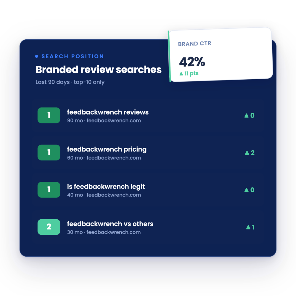
The best CPA websites pick a clear position, like the go-to CPA in one city or the CPA for one industry, and say it in the first line. They show a Google rating and a real person up top, make one next step obvious and add pricing, niche and location pages behind it. The 13 firm sites below each show a different way to do that well.
- Pick a position before you pick colors. Local authority, industry niche, premium advisory or price transparency.
- Your hero line should read like a search: service, who you help, where.
- Offer a first step that isn't a sales call, like a free tax analysis, assessment or checklist.
- Published pricing and a plain promise, like every return reviewed by a CPA, build trust fast.
- Grade your own site with the scorecard below before you spend a dollar on a redesign.
Four ways the best CPA websites stand out
Most CPA websites try to be everything to everyone, so they say nothing. Every firm in this roundup picked a lane. All 13 sites were built by our team, and they fall into four plays.
The four CPA website positions
You can mix them. Plenty of these firms are local and also lead with a free first step. But pick one to put in your headline, because a visitor only reads one line before deciding to stay.
Local CPA websites that own their city
These firms want to be the obvious choice for small businesses in one market. Each one names the city in the first line, which helps them show up for "CPA near me" searches and tells locals they've found the right place.
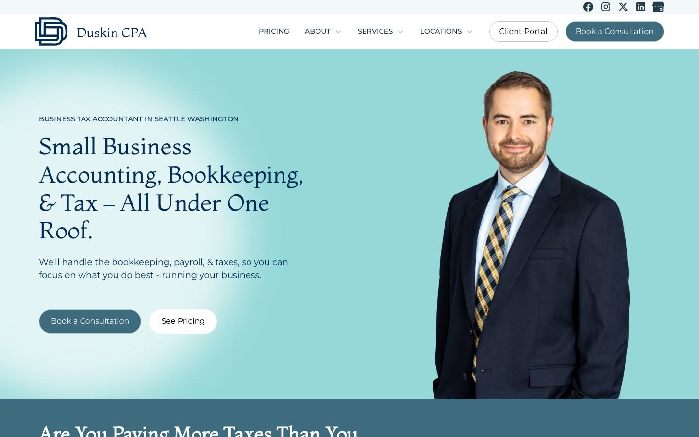
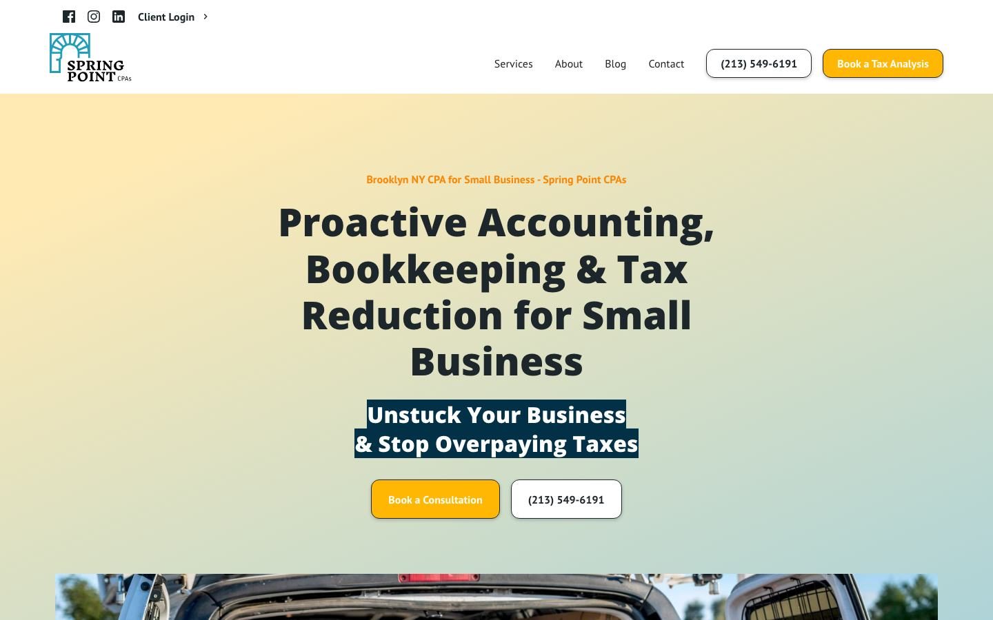
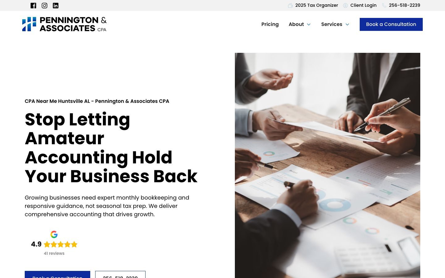
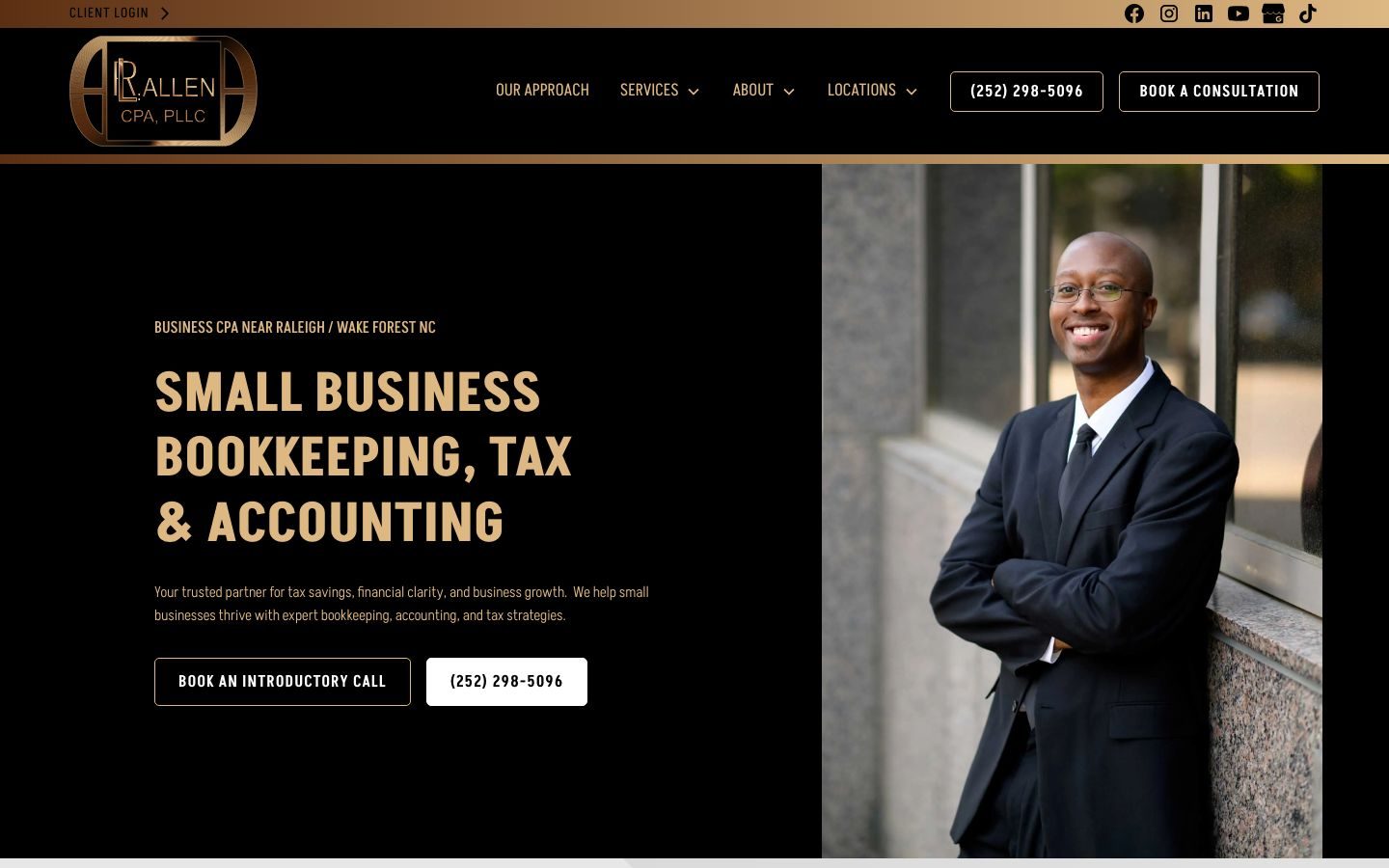


CPA websites that win with a niche or a first step
These four don't just say where they are. They say exactly who they're for or exactly what happens next, which makes the decision easy for the right visitor.
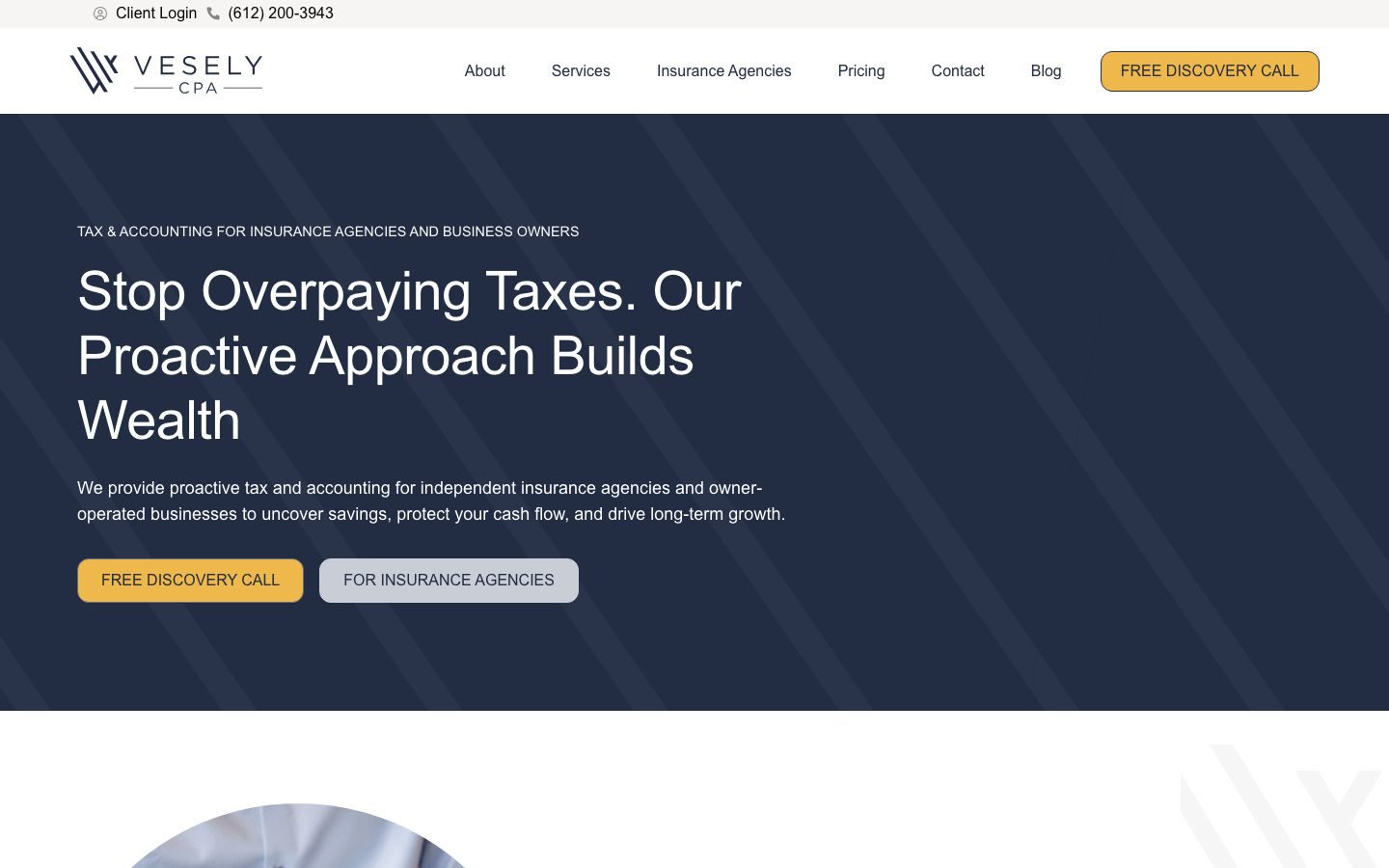
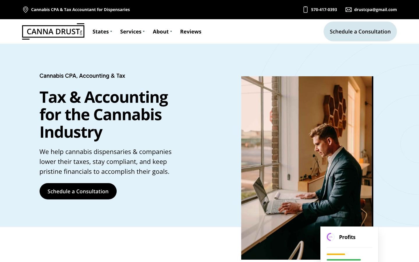
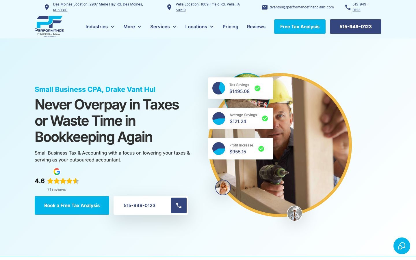
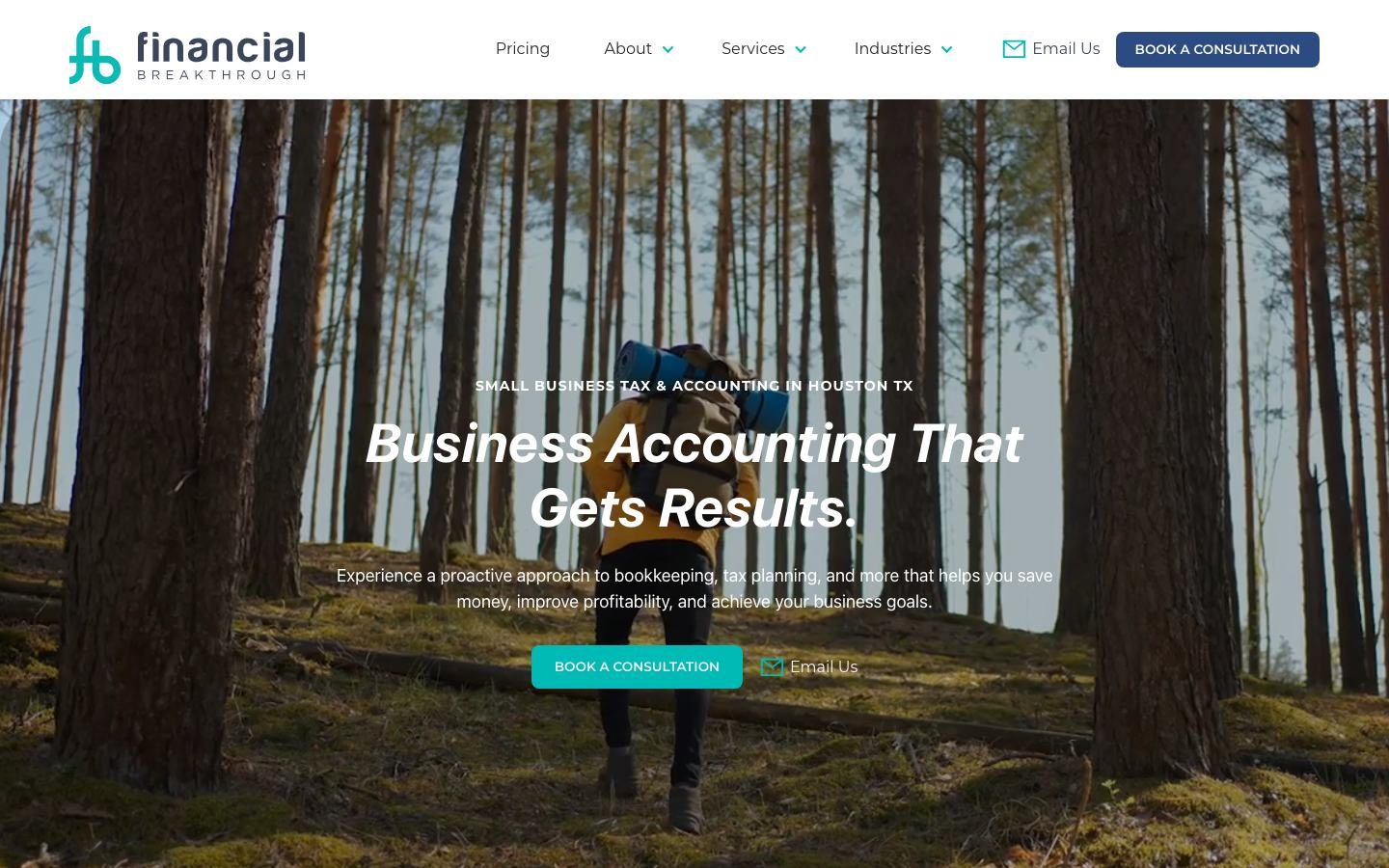
Two CPA website features more firms should steal
1. Pricing and promises on the homepage
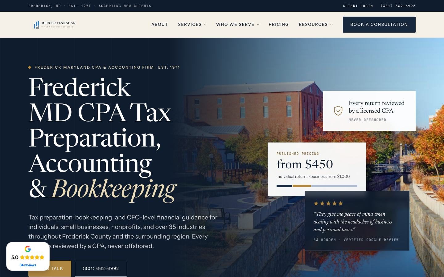
Most CPA firms hide pricing because they're afraid of scaring people off. But a starting point works the other way. Owners who call already know you fit their budget, so your consultations get shorter and more focused.
2. A lead magnet for people who aren't ready to call
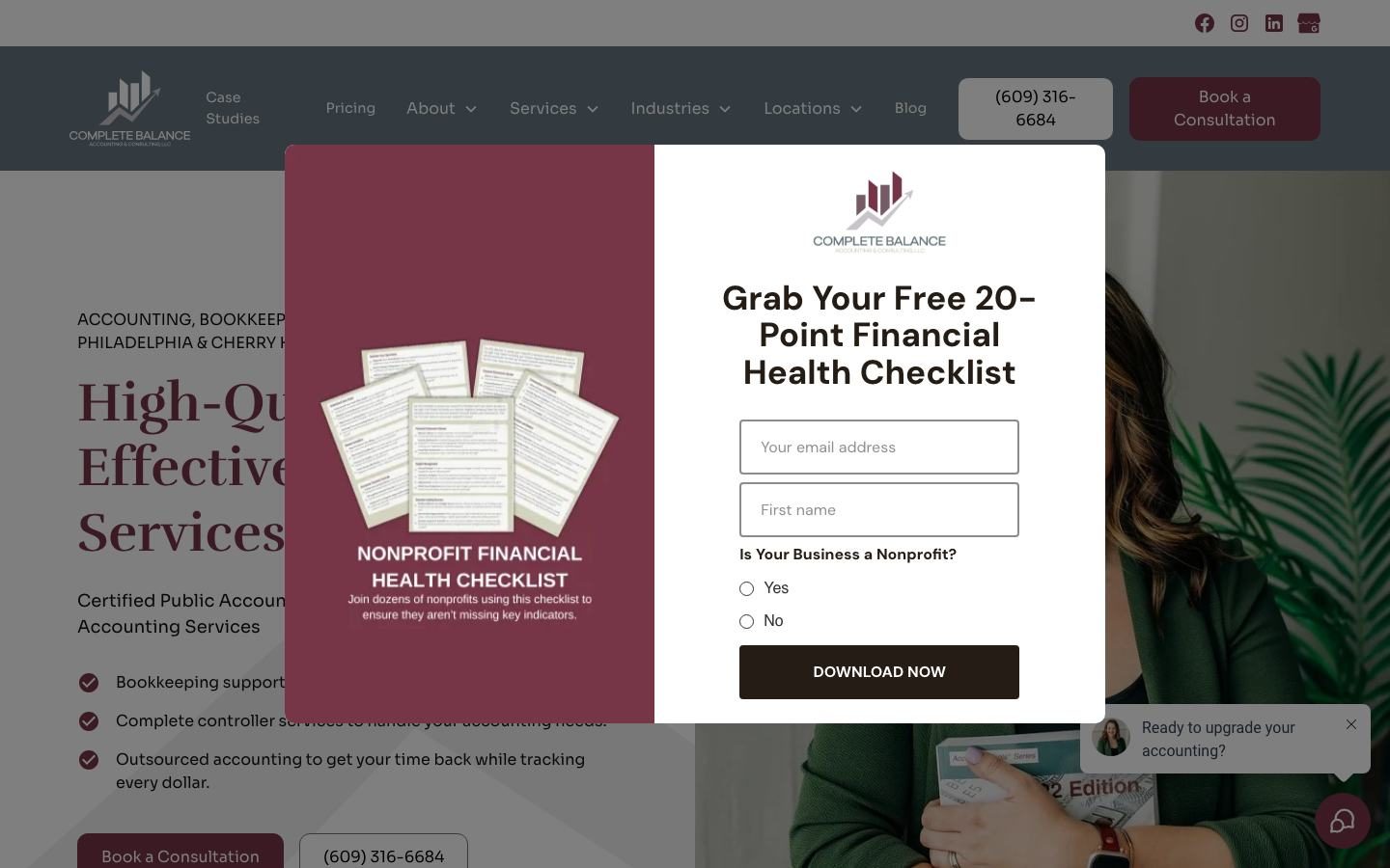
Most visitors won't book on their first visit. A checklist, guide or free analysis gets their email so your follow-up can do the rest. That follow-up runs automatically in Feedbackwrench OS, with texts and emails that keep your firm top of mind.
Grade your own CPA website: the scorecard
Open your homepage on your phone and score yourself one point for each row you nail. Eight or more and you're in good shape. Under five, your site is likely costing you clients.
| What good looks like | Seen on | |
|---|---|---|
| First line | Service, who you help and where | West CPA Group, Duskin CPA |
| Headline | An outcome owners want, in plain words | Pennington, Gran Vista |
| Proof | Google rating visible without scrolling | Tina Worrell CPA, Performance Financial |
| People | A real portrait, not stock | R.L. Allen CPA, Duskin CPA |
| Main button | One clear next step, repeated | Vesely CPA, Duskin CPA |
| Second offer | A free analysis, assessment or checklist | Complete Balance, Gran Vista |
| Pricing | Starting prices or a pricing page in the menu | Mercer Flanagan, Duskin CPA |
| Niche pages | A page for each industry you serve best | Vesely CPA, Canna Drust |
| Locations | A page for each city you want to win | Performance Financial |
| Phone | A tap-to-call number in the header | Most examples here |
Six mistakes we see on most CPA websites
Jargon like accrual basis and reconciliation belongs on deeper pages. Your homepage is for owners who'd rather not think about accounting.
A handshake or a calculator tells visitors nothing. Your own face tells them who they'll be working with.
If owners can't find a starting point, many assume you're too expensive and leave.
Give people a button to book, a number to call and a free first step. Different visitors want different doors.
Nobody clicks a Testimonials tab. Put your Google rating in the first screen.
Tax planning, bookkeeping and payroll each deserve a page. That's how you rank for each one.
Getting a CPA website that works this hard
Choose your position
Local authority, niche, low-risk first step or transparency. Write it as one line.
Write your hero and offer
Your headline, one outcome sentence, your main button and a free first step.
Plan your pages
Services, pricing, industries, locations, about and FAQ. These do the ranking and closing.
Shoot real photos
A short session with you and your team pays off on every page.
Track every lead
Know which pages and ads bring booked calls, not just clicks.
We build websites for CPA and accounting firms every week. See how we do it on our websites for accountants page, or browse a dozen more firm sites in our accountant website examples.
Questions people ask
What makes a good CPA website?
A clear position stated in the first line, a plain outcome headline, a Google rating and real photos above the fold, one obvious next step and pages for each service, niche and city you want to win.
Should a CPA firm website show prices?
Showing starting prices or a pricing page helps owners self-qualify. Firms like Mercer Flanagan put starting prices right in the hero, so visitors know the range before they ever call.
Should my CPA firm focus on a niche?
It's the fastest way to stand out. You can still serve everyone, but a niche headline and niche pages make your best-fit clients feel like the site was built for them.
What's a good lead magnet for a CPA website?
Something owners want before tax time or before a big decision, like a free tax analysis, an S-Corp check or a financial health checklist. Keep the form short.
How long does it take to build a CPA website?
It depends on how many pages you need and how fast messaging and photos come together. Book a call and we'll map out a timeline for your firm.

Rob built Feedbackwrench and Nuance Financial Tax & Accounting. Since 2015, our team has helped transform 550+ small businesses with marketing, strategy and systems.