The best converting websites make it obvious in five seconds what you do, who it's for and where, then show proof like a Google rating and give one clear next step such as Get a Quote or Book a Call. They lower the risk with a free first step, show real photos and remove friction with tap-to-call, short forms and financing. The 13 examples below come from home services, health, fitness, events and accounting.
- Conversion starts with clarity. If a visitor can't tell what you do in five seconds, nothing else matters.
- One main button, repeated all the way down the page. Different wording on every button confuses people.
- Show proof in the first screen: a Google rating, license numbers, an "as seen on" badge or a real result.
- Lower the risk with a free first step like a quote, inspection, intro session or discovery call.
- Track what happens after the click. A beautiful site with no tracking can't tell you what's working.
The 8 principles behind websites that convert
Every site in this showcase was built by our team for a real business. They look different because the industries are different, but they follow the same eight rules.
Eight conversion principles
Look for these in every example below. When a site skips two or three of them, you can feel it. It might look nice, but it doesn't make you want to pick up the phone.
Home service websites that convert
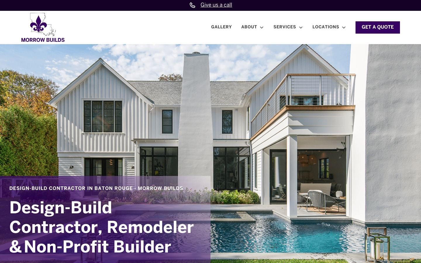
Home service buyers are usually comparing three or four companies at once. These sites win the comparison in the first screen.
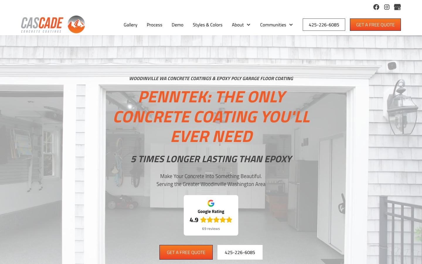
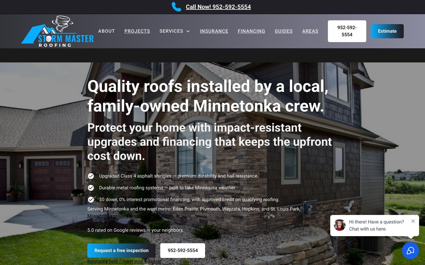
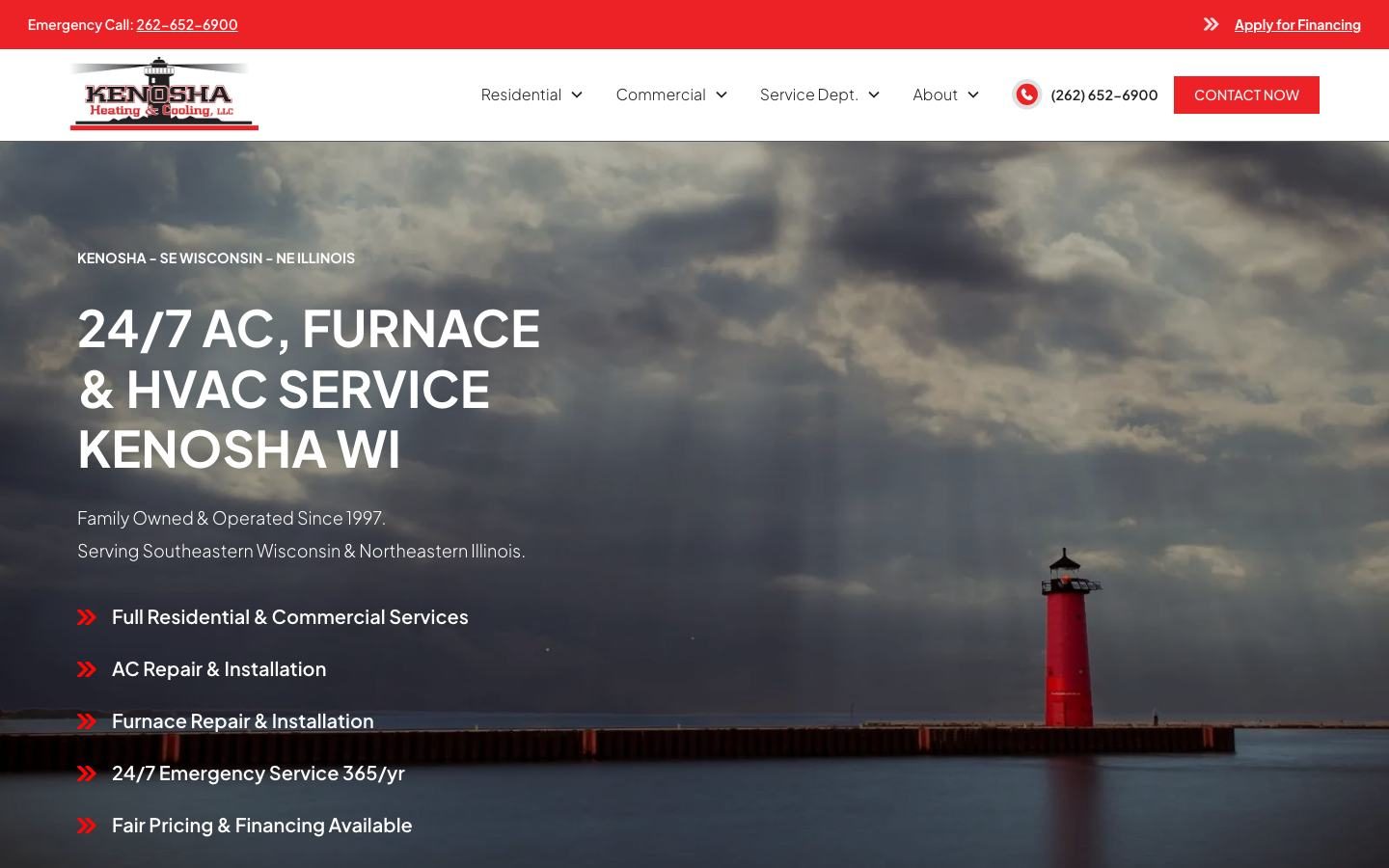
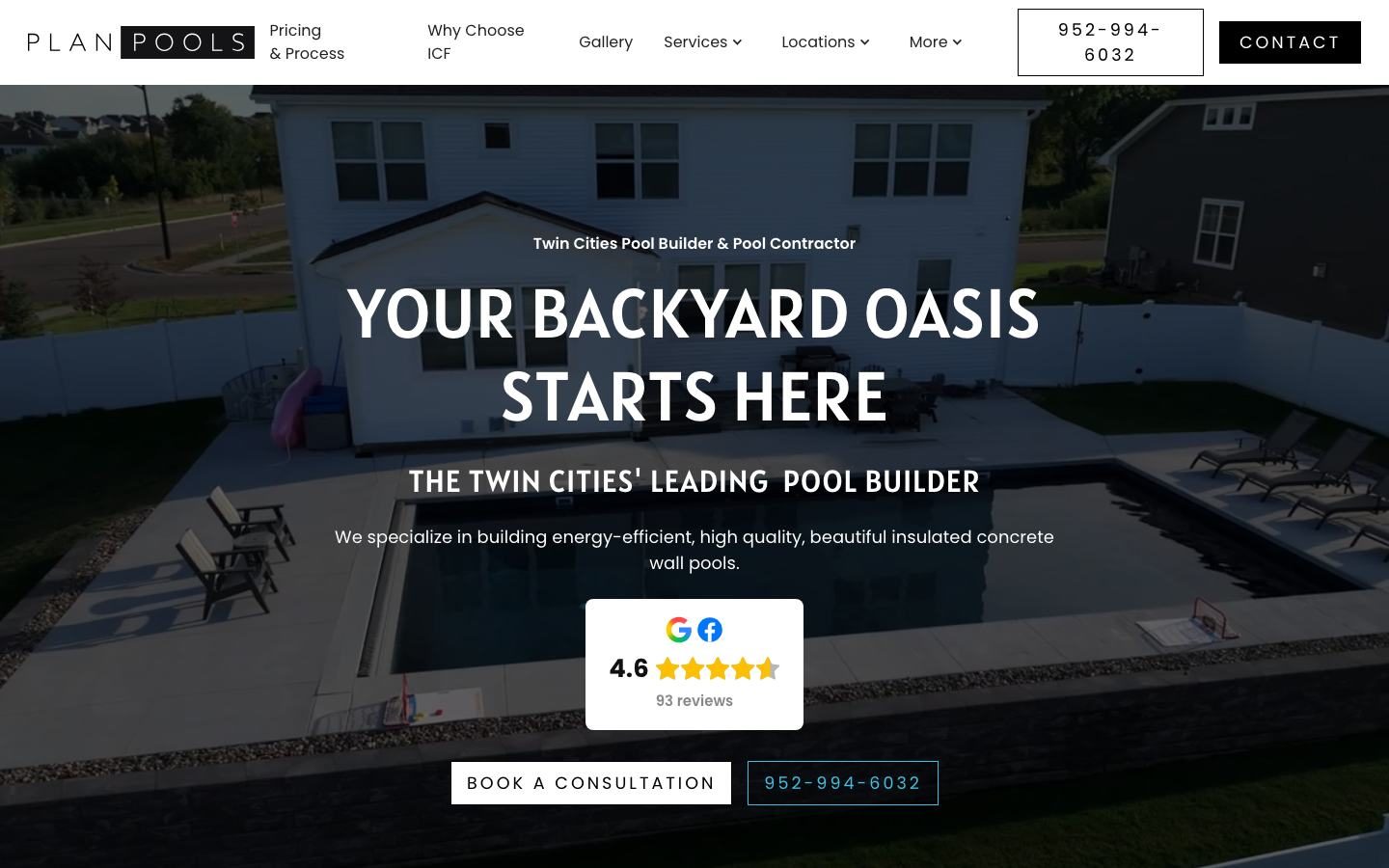
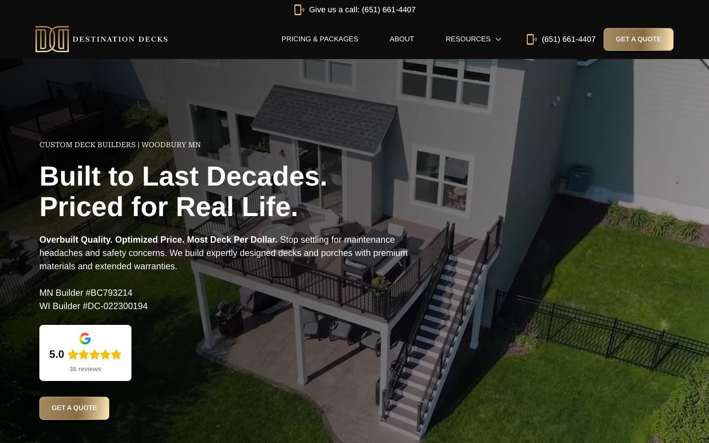
The hero image above, Destination Decks, adds a smart trust signal you rarely see: state builder license numbers right under the headline, next to the Google rating. Its menu also leads with Pricing and Packages.
Health, wellness and fitness websites that convert
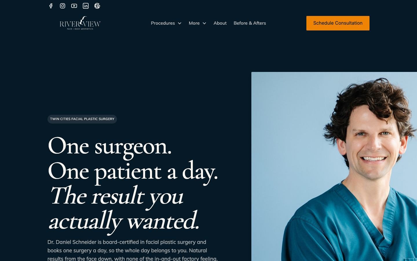
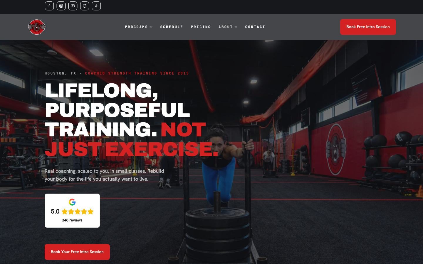
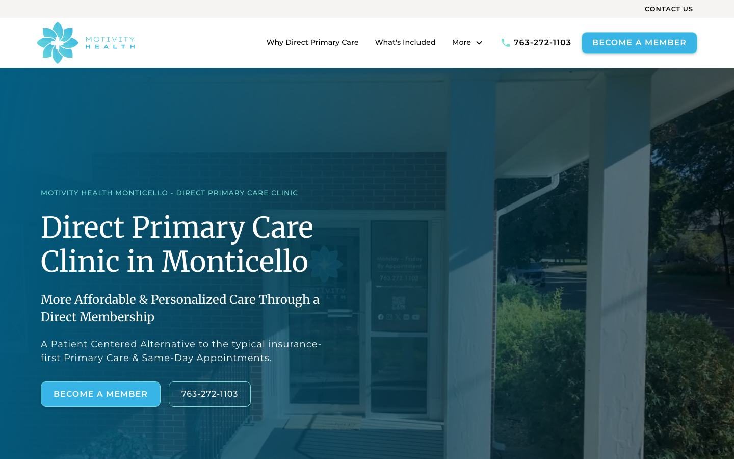
People choosing a doctor, surgeon or gym are nervous about getting it wrong. These sites calm that fear with a specific promise and an easy first step.
Professional service websites that convert
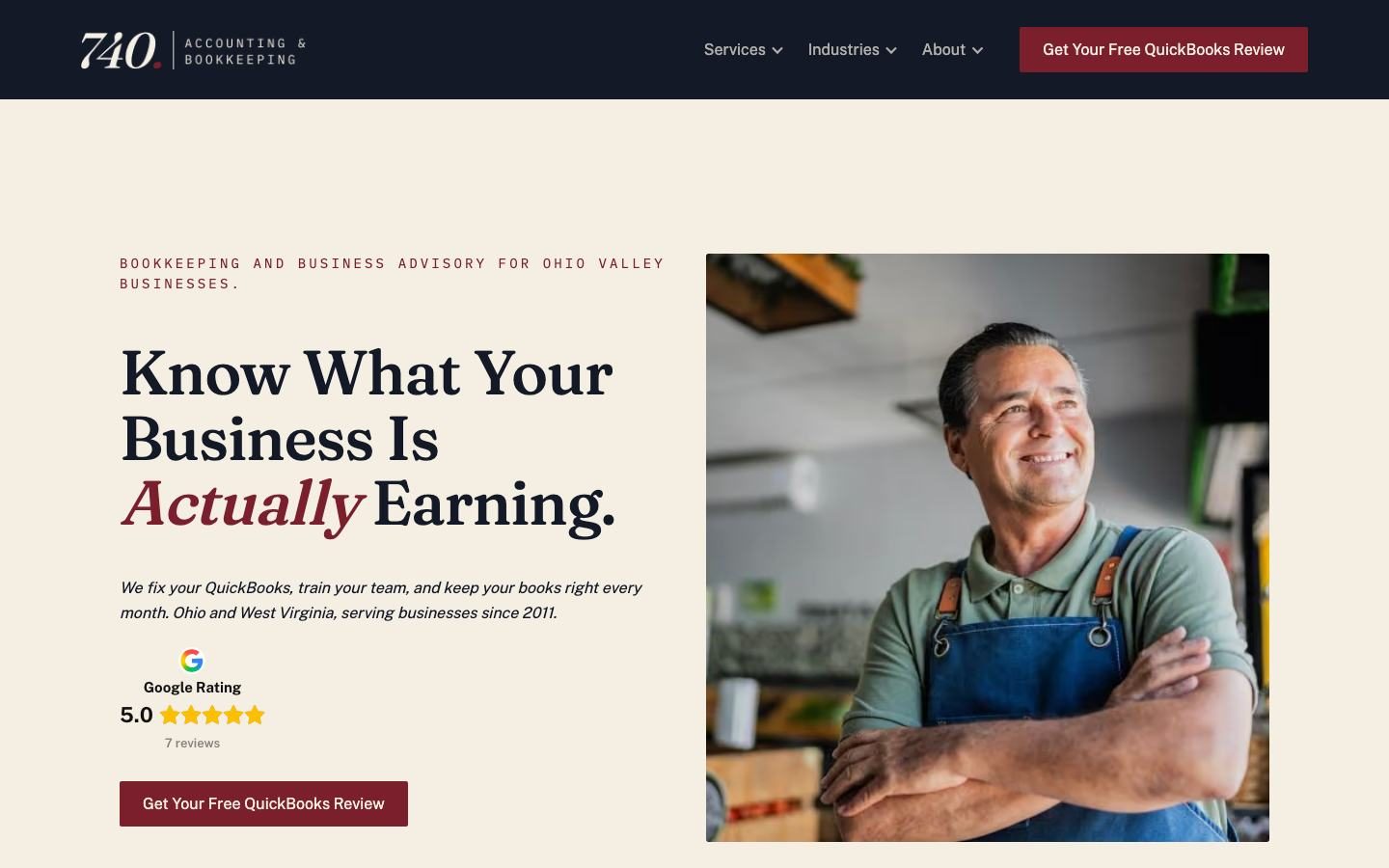
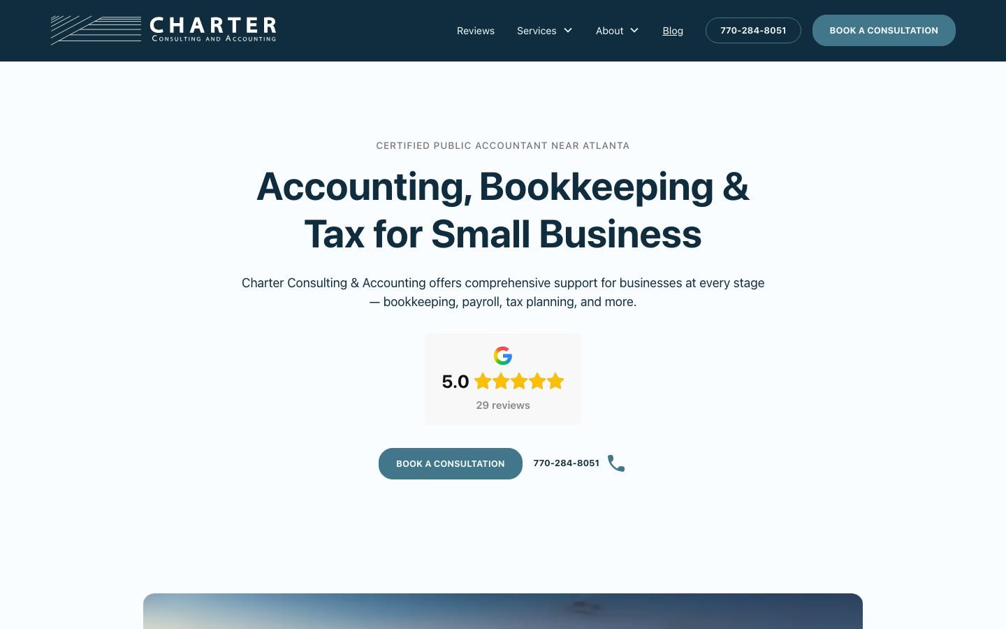
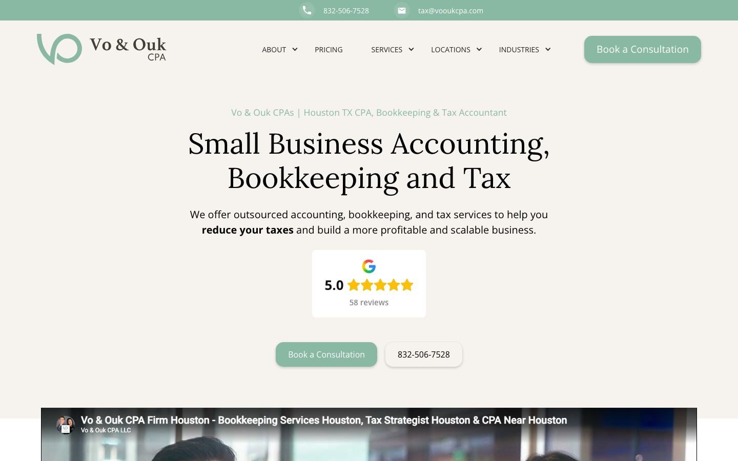
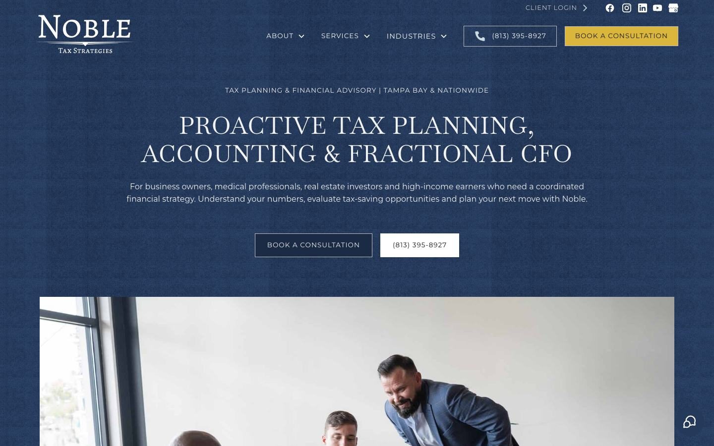
Accounting and advisory firms sell trust and expertise, which are hard to show in a photo. These sites do it with clean layouts, reviews and plain language.
Borrowed trust: proof you can put above the fold
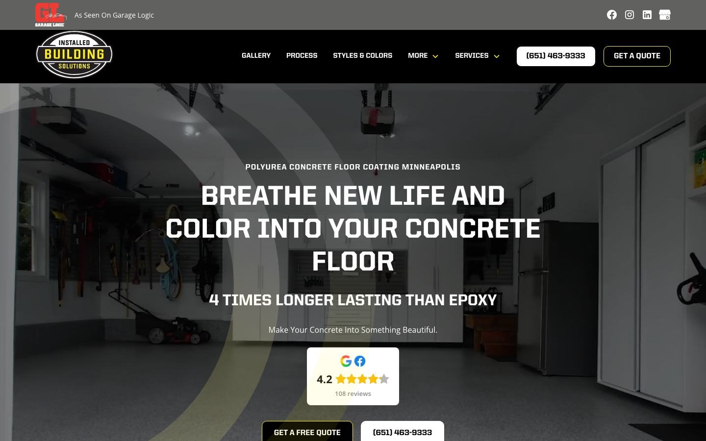
A Google rating is the most common proof on these sites, but it's not the only kind. Here's what we put in the first screen depending on the business.
| Proof | Best for | Seen on |
|---|---|---|
| Google rating badge | Almost every local business | Kinitro Fitness, Cascade, Charter |
| License numbers | Contractors and builders | Destination Decks |
| Years in business | Trades where longevity matters | Kenosha Heating and Cooling |
| Media mention | Anyone featured by a known outlet | Installed Building Solutions |
| A specific promise | Premium or high-stakes services | Riverview Facial Plastic Surgery |
| A video | Firms that sell trust and expertise | Vo & Ouk CPA |
Remove friction and lower the risk
Most visitors aren't ready to commit on the first visit. The sites above give them an easy yes and get out of their way.
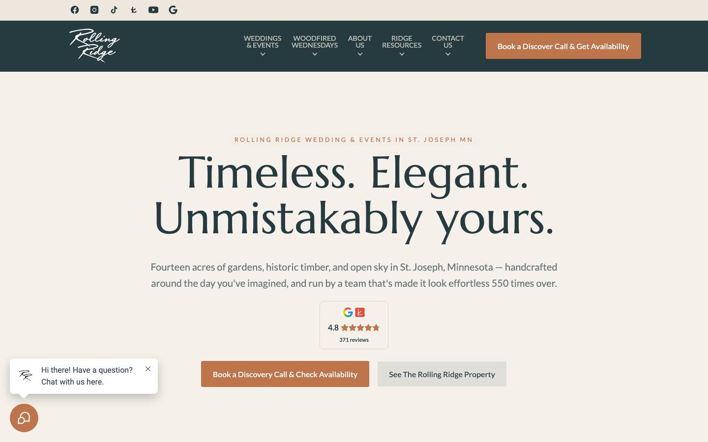
Free inspection, free quote, free intro session or a discovery call. Small yes first, big yes later.
A phone number in the header that dials on tap. Many buyers, especially for urgent jobs, would rather call.
Name, phone, email and one question. Every extra field costs you leads.
Storm Master and Kenosha put financing in the first screen. It can turn "maybe next year" into "let's talk".
Destination Decks and Plan Pools lead their menus with pricing. Buyers who call already know the range.
Send every form and missed call to your CRM with an instant text back. We run ours on Feedbackwrench OS.
A converting website is only half the job
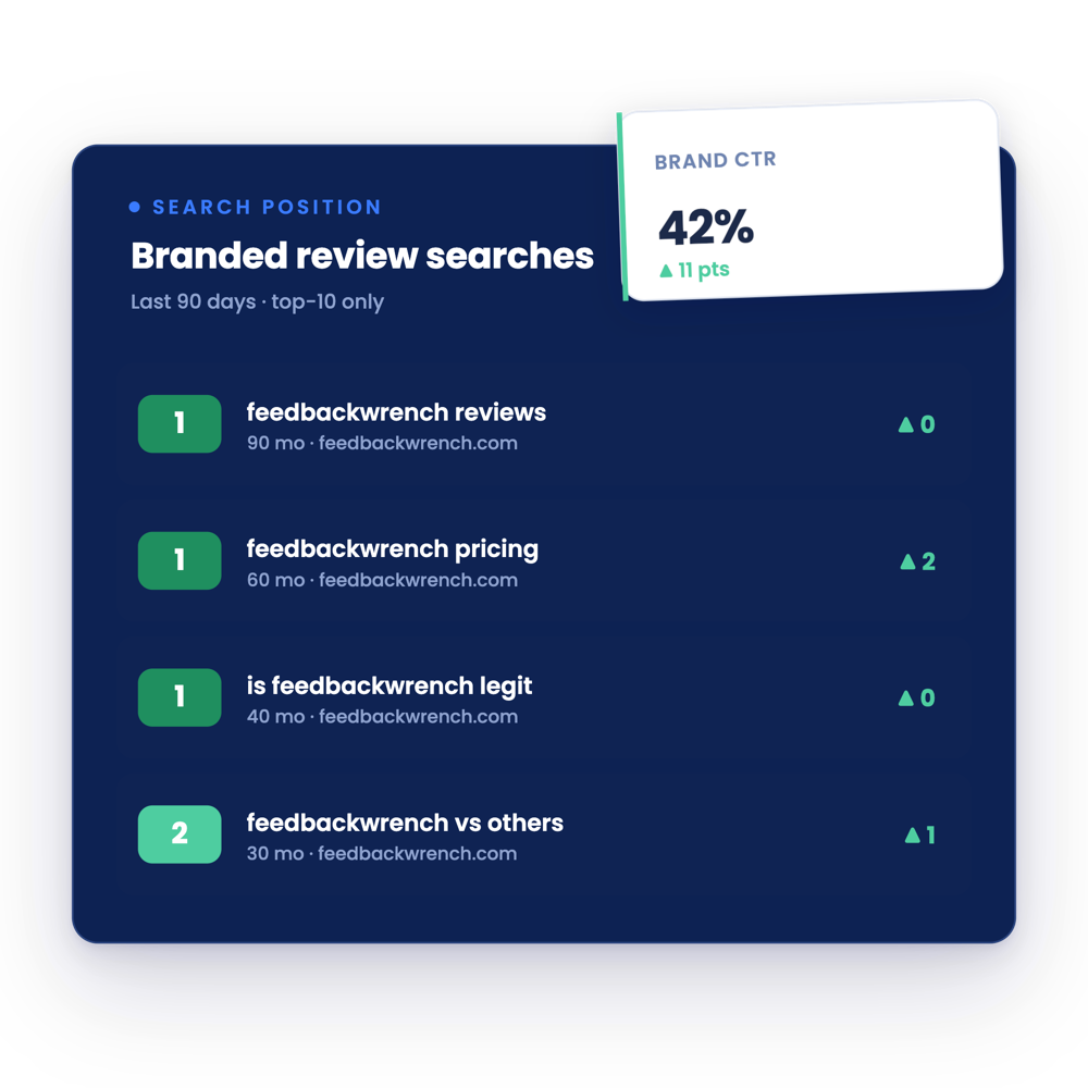
The best website in the world can't tell you whether your ads, SEO or referrals are bringing in customers unless you track it. That's where most businesses lose money.
Source: Feedbackwrench client work
Track every call and form
Know which page and which source each lead came from.
Follow leads to revenue
Tie each customer back to the channel that brought them in.
Move money to what works
Cut channels that bring clicks but no customers and put that budget where customers come from.
That's how we build every site, with SEO, ads and tracking tied together. See our web design process, or browse niche examples for accountants and home builders.
Questions people ask
What makes a website convert?
Clarity about what you do, who it's for and where, proof in the first screen, one clear call to action repeated down the page, a low-risk first step, real photos and as little friction as possible.
What is a good conversion rate for a small business website?
It varies a lot by industry, traffic source and offer, so compare your site against itself over time. Track calls and forms by page and source, then improve the pages that get traffic but few leads.
Should my website have one call to action or several?
One main call to action, repeated, plus a phone number. A second, softer option like Watch a Video or See Our Work is fine, but don't give people five different buttons.
Do reviews on my website really help?
Yes. A visible Google rating answers whether you can be trusted before a visitor has to ask. Put it in the first screen, not on a separate testimonials page.
How do I know if my website is working?
Track every call and form back to its source and page, then tie those leads to actual customers. That shows you which pages and channels make money.

Rob built Feedbackwrench and Nuance Financial Tax & Accounting. Since 2015, our team has helped transform 550+ small businesses with marketing, strategy and systems.